
Fun with Hominin Cranial Capacity Datasets (and Excel), Part 2
 Due to popular demand I have made some more charts that are slightly more complex than the hominin cranial capacity chart from yesterday’s post.
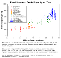
In the first chart, I have taken the “favored” taxonomic labels for each specimen from De Miguel and Henneberg (2001). Many specimens have been put in different species or different genera by different taxonomists, but these are supposed to represent something like the consensus, as the authors judged it in 2000. Australopithecus fossils are in red with various symbols, early Homo fossils (Homo habilis and others just labeled “early Homo” or “Homo”) are in orange, H. erectus is in green, and the asundry variations on Homo sapiens are in blue.

The vertical bars on the right side represent the variation in cranial capacity for modern human males and females, taken from the McHenry et al. 1994 chart.
We can see here a point made by an actual anthropologist in the comments to the other post, which is that cranial capacity is not constantly increasing in every species. By eyeball inspection, it looks like there was a surge between Australopithecus - Homo habilis - Homo erectus, then stasis for 500,000 years in erectus, then another surge over the last million years (but note that this has leveled off – modern humans actually have smaller brains than Neandertals). Of course (and I emphasize), eyeball inspection is not a statistical analysis, and even a statistical analysis of stasis and change in hominin species would require some decisions about which taxa are “good species”, and this turns out to be a rather difficult thing to decide for many specimens (see below). The models that De Miguel and Henneberg fit to the data indicate that if one take the broad view across all of the species for millions of years, swamping out local events and local stasis, there is a pretty consistent exponential growth trend.
One nice feature of this chart is that we can place creationist claims in a quantitative context and see if they are meaningful. As I mentioned last week, Casey Luskin of the Discovery Institute likes to manufacture a “gap” in the hominin fossil record by citing papers that prefer to label Homo habilis as Australopithecus habilis. That accomplished, he dusts his hands and declares that that is the spot that God intervened (er, “the designer”) to create the clearly human Homo erectus and its impressive 800 ml cranial capacity. Presumably this is also the spot where Luskin thinks the Intelligent Designer created proto-humans with 48 chromosomes which just happen to match the great ape chromosomes.*
Anyway, what actually happens to the evidence if we switch the labels on habilis? I’ve done just that in this chart:
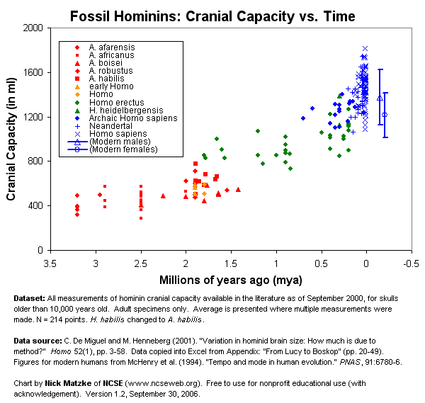
See, there’s no fossil evidence for human evolution now!
More fun with labels
It is often written that hominin taxonomy is contentious, with “lumpers” and “splitters” arguing about where to draw lines and what counts as a fossil “species.” I often wonder if this argument is useful activity, since really, the only people who actually think that fossil species should always be distinct and morphologically discontinuous from other species are the creationists. With evolution, species are not permanently stable entities, and here and there they are going to intergrade with other species. It’s just a fact of life that some species are going intergrade, and thus going to be impossible to describe completely with typological labeling. Some specimens will fall in group A, some in B, and some in-between.
Part of the paradox here is that taxonomy will be especially difficult where the evidence for gradual evolutionary change is especially good. I think you can see this somewhat in this next chart. Here, I have created a category called “multiple”, which applies to any specimen that received more than one species designation according to De Miguel and Henneberg 2001.
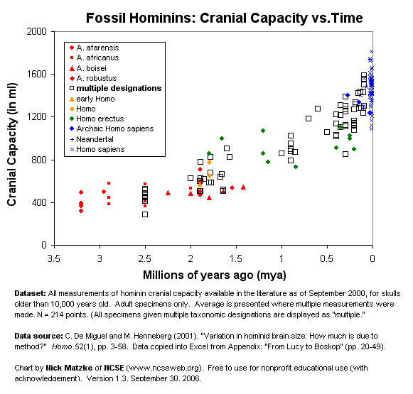
Of course, this isn’t perfect, since some of the species names causing some of the “multiples” are no longer in use and wouldn’t be considered “live” controversies in paleoanthropology. And there are some specimens given vague labels like “early Homo” that probably indicate taxonomic uncertainty, but this was the only designation available so I left them as-is. On the other hand, there does appear to be quite a bit of confusion about the boundary between Australopithecus and Homo, and about the differences between H. erectus and early H. sapiens.
The Excel spreadsheet is probably too big to upload on PT given our constant bandwidth issues, but I have emailed it to a number of people (my email is: matzkeATncseweb.org). It is not particularly “nice” looking at the moment, of course, but feel free to use/modify it for nonprofit educational purposes, with attribution. Someone with some bandwidth might even upload it on their website.
Notes
* Luskin postulates that the non-evolved 48-chromosome human ancestor then evolved into the 46-chromosome modern human through chromosome fusion, thus miraculously explaining away Kenneth Miller’s argument that the fused chromosome in humans is evidence of common ancestry with the apes. I Am Not Making This Up. Here is Luskin’s graphic:
I suppose he thinks the Intelligent Designer created the endogenous retroviruses and plagiarized errors we share with apes in the human genome also, just to be clever.